The rise in the earth’s temperature

Environment

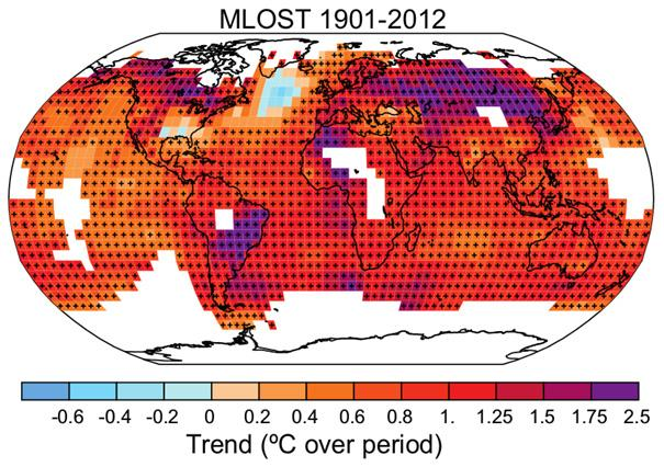
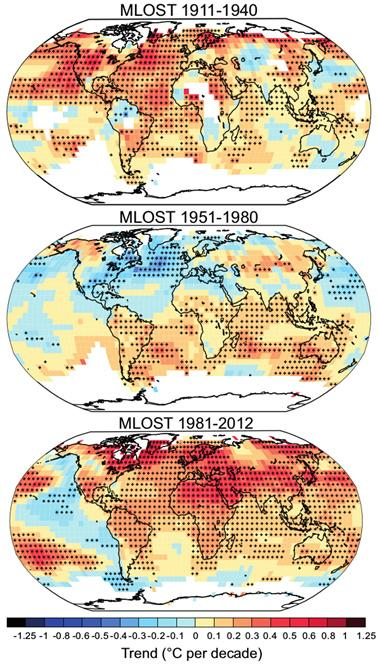
Are temperatures rising in all regions of the world?No, not quite. It depends in part on the time period and the size of the region under consideration.It is now accepted that the global average temperature has been rising since the beginning of the 20th century, with an acceleration of warming towards the end of the period. However, the mapping of this warming (or spatial distribution) reveals significant contrasts.The figure above shows temperature trends, estimated at each point 1 on the globe, over the period 1901-2012. As this is a fairly long period, climate variability is relatively low, and the trends are essentially representative of long-term evolution. The map shows that the vast majority of regions have experienced a rise in temperature. 

The most notable exception is part of the North Atlantic Ocean, off the southern tip of Greenland. Although much less extensive, part of the southeastern United States has warmed little or not at all over this period. This map provides a broader illustration of the disparities observed. Alongside regions that have cooled, some have seen their temperatures rise much more sharply (sometimes by more than 2°C), including Central Asia, large parts of Canada and southeastern Brazil. Parts of the South Atlantic and Indian Oceans have also warmed faster than the rest of the oceans.Although not explicitly illustrated, this figure shows that if we focus on large regions, i.e. a continent or an ocean basin, warming is indeed observed in all regions of the world (with the notable exception of Antarctica, for which very little data is available).

We need to go down to finer spatial scales to find regions that are cooling.Even when focusing on large regions, this map shows that warming is not uniform across space. Two features of this spatial distribution are particularly noteworthy. Firstly, warming is, on average, faster on continents than on oceans. Secondly, Arctic regions are warming faster than tropical regions and most of the Southern Hemisphere.

It is worth noting that, in both cases, these are the characteristics expected of warming due to an increase in the greenhouse effect. In the second case, in particular, we speak of an Arctic amplification of warming, partly linked to the melting of some of the solid water (snow and ice) covering the pole, which contributes to cooling the surface by reflecting solar radiation.

This amplification is only partially illustrated here, as observations near the poles are still rare, and can only rarely be used for this type of calculation (see in particular the missing data in the previous figure).The figure below provides a comparable illustration, but for shorter periods (1911-1940, 1951-1980 and 1981-2012). This figure illustrates the modulation of warming, both in time and space. Depending on the sub-period considered, regional cooling can be observed, or even an absence of warming on a global scale between 1951 and 1980.The diagnosis of observed warming thus depends on the time period considered.

During the most recent period, i.e. the one that saw the greatest increase in atmospheric greenhouse gas concentrations, warming was relatively marked on average, but spared a large part of the eastern Pacific Ocean, as well as part of the Southern Ocean. However, almost all continents are warming, with marked disparities.

Finally, a more original way of looking at the world’s “regions” is to consider not just the surface, but a three-dimensional atmosphere. For example, satellite data and balloon measurements enable us to assess the temperature of the atmosphere at altitude.

These data point to a warming of the entire troposphere (lower layThese data point to a warming of the entire troposphere (lower layer of the atmosphere, approximately between the surface and 10 km altitude). In contrast, the stratosphere (intermediate layer, between 10 km and 50 km altitude) has cooled markedly in recent decades. Although it may seem counter-intuitive, this cooling is also partly explained by the increase in the greenhouse effect. Finally, if we look below the surface, various studies have identified an increase in the ocean’s heat content, which can be linked to an average temperature, in its superficial layer (a few hundred meters).r of the atmosphere, approximately between the surface and 10 km altitude). In contrast, the stratosphere (intermediate layer, between 10 km and 50 km altitude) has cooled markedly in recent decades. Although it may seem counter-intuitive, this cooling is also partly explained by the increase in the greenhouse effect. Finally, if we look below the surface, various studies have identified an increase in the ocean’s heat content, which can be linked to an average temperature, in its superficial layer (a few hundred meters).

Notes1. A “point” here is in fact a “small square” approximately 500 km on a side. Temperature data sets suitable for this type of study, and available on a global scale, are no better resolved.Center national de la recherche scientific
Intergovernmental Panel on Climate Change 

https://ncar.ucar.edu

https://www.ncei.noaa.gov/products/land-based-station/noaa-global-temp

https://www.ncei.noaa.gov/access/metadata/landing-page/bin/iso?id=gov.noaa.ncdc:C00759

Leave a Reply

Your email address will not be published. Required fields are marked *

en_USEnglish